(click to enlarge)
emilamorTres
1102701449 | MCC0023 | COMPUTER GRAPHIC TWO | KEDAI GAMBAR | EF SI EM |EM EM YUU
Sunday, January 9, 2011
Wednesday, January 5, 2011
Assignment 2 : The Editing Part 4
Part 4
Almost there with numbers
Yes, you read well. Numbers I say. What good a calendar is without its dates.
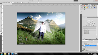
I know I know, your first impression should be "What the heck is with those numbers?!" Well, a previous post of mine did explained I wasn't a big fan of Photoshop. Hence. the lack but increasing of knowledge towards it's usage. I borrowed a copy of my group mate's picture ( just to see how she arranges the dates and such )
The turquoise-neon lines are guidelines dragged from the Ruler. This is so I can estimate the exact placement of the dates.
Okay, that's it for my editing part. Time for my final product which will be reveal on the next post.
Wednesday, December 29, 2010
Assignment 2 : The Editing Part 3
My apologies for the brief intrusion ( Exercise 2 : Blimey!) Now onwards.
Part 3
The eerie town
CTRL J then I made it monochrome, using Hue and Saturation which strikes the mood better.
Now, imposing the previous picture on this gives it a rough finish. What I really want to do is select the...
Eraser Tool with an opacity of 30% to smoothen those edges. Like so...
CTRL T to enlarge the picture(me).
Okay, now we are almost done. What's left is the most important part of a calendar, now what could it be? We'll find out on my next post.
Sunday, December 26, 2010
Thursday, December 23, 2010
Assignment 2 : The Editing Part 2
Part 2
A continuation from the smile
This eerie back alley will be my background for the demon (jester).
Aha, there you go. What I didn't show you was the jester hat I impose. Unfortunately, the picture for that part was lose during editing. But that's pretty much it for the jester hat.
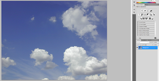
I increased the brightness next. But I noticed due to the increase of brightness, the sky almost disappeared. Luckily...
The clouds are here to save me.
Again, Quick Selection Tool and impose.
The final step for this part, added clouds for a mysterious feeling. Open Filter > Render > Clouds
Sunday, December 19, 2010
Assignment 2 : The Editing Part 1
Turn out, I'm gonna use the photo from my previous post. Now, I shall go through a step by step editing tutorial which will be divided into 4 parts.
Lets start with the basics
Open the file and CTRL J to duplicate in case of faulty work.
I started a new layer for make up, to cover my face.
Lets start with the basics
*the following are to show the tools and steps I used, each image below are not leading towards the final product*
Open the file and CTRL J to duplicate in case of faulty work.
I started a new layer for make up, to cover my face.
Now, using the Brush Tool I painted my face white (opacity 30%)
A new layer, lipstick seen above to add a Glasgow grin on my face.
Decided to use brush 46 for the lipstick
And there you a go, a very rough editing for my face.
Thursday, December 16, 2010
Assignment 2 : A Simple Portrait
Took a random photo today. Hopefully will use it as my demon-self photo. And yes, I did say hopefully. Since a jester plays a lot with shapes and patterns, a "kain pelekat" and a stripe t-shirt should do the trick.
Wednesday, December 15, 2010
Assignment 2 : Ideation
For my (Demon) part, I had to just a certain evil character. It was no surprise that I decided to choose Jester as my demon-self. I always had a deep fascination towards this particular figure. Someone who's laugh is as menacing as his demeanor.
Monday, December 13, 2010
Saturday, December 11, 2010
Assignment 2 : The Angeling
The following are the steps I took for my angel-themed photo.
First, I open the original file and CTRL J to duplicate it in case of faulty work.
Afterwards, using Quick Selection Tool. I imposed a new background.
Now, using the Brush Tool. I paint on me a dash of white to illustrate a light effect.
The remaining white that was on me was remove by using the Eraser Tool.
Again, using the same basic understanding of the Quick Selection Tool. I imposed a pair of wings onto me. Magical isn't?
Almost there, I placed the dates of the month using Text Tool. The next step also requires the same tools.
April 2011
Wednesday, November 17, 2010
Monday, November 8, 2010
Hide N' Seek
I've noticed some of you have failed to find the Follow button. Keep in mind it's at the upper left side bar on my blog and you have to sign in a Google or any other email service account to see it. Thanks.
For an even awesomer "Follow Me" click here
Friday, November 5, 2010
Wednesday, November 3, 2010
Saturday, October 30, 2010
Thursday, October 28, 2010
Introduction
This is me trying to
EATTT A BABY TURTLE !!
◘ I've made dozens of intros thus far so I'll keep it simple.
HOME | SCHOOL | PLAY | HANGOUT | TARAWIH | GREW UP FROM HERE
I LOVE THIS DUDE
I HATE A PERSON WHO CALLS HIMSELF THIS
I DROOL OVER THIS
I FEEL SAFE WITH THIS
I PLUCK AND STRUM THIS
THUMBS UP TO GIRLS LIKE THIS

CAN'T GET ENOUGH OF THEIR FOOD
AND THEIRS TOO , SUSHI <3
THEIR MUSIC INSPIRES ME
I CRIED WHILE PLAYING THIS
I DESIGNED THIS...
...FOR YOU
I'VE JUST GOTTEN THE HANG OF THIS
Subscribe to:
Comments (Atom)


