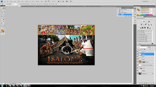
Hey, its almost mid term and I'd like to show you my E-Wallpaper. An assignment us FCM students have been researching and designing since the start of the semester. My E-Wallpaper is of the Ibalong Festival which you can learn more by reading my previous post here. Now, lets see how I design this very simple yet quite the eye-catcher wallpaper.
I first start off by opening my desired background. As you can see, its still plain and has not been edited whatsoever.
Afterwards, I created a new layer to type in "IBALONG" using the Horizontal Type Tool.
Now here is the best part. Here you could see I've open a new picture and paste it on the background. What I'd like to do now is put the picture into the text "IBALONG". This will create a very interesting fiery effect to the text. To do so I selected Create Clipping Mask. Let's see if I've succeeded...
Viola ! Marvelous isn't it? But I'm way far from done.
Credits to this guy for the clipping mask tutorial.
Again, using the Horizontal Type Tool. I type in the story behind the festival which is " Honoring Baltog, Handiong, Bantong freeing Old Bicol". Now that's done, I can move on forward with the next step.
Using the Rectangle Tool, I stretched out a rectangle taking a summable space from the background. Next, I lower down the rectangle's opacity to 80%. Why I did this? I'll explain more as we go on.
Ahaa ! That's one messy picture isn't it ? Let's clean it up abit.
Now, that's better. What you just saw is the main four picture I choose which I thought best describe the festival. After all, what is a festival if it isn't filled with mesmerizing colours, rite?
After I close the visibility of the other three previous pictures, I use Free Transform to resize the picture of that wonderful girl. I repeated the process with the three remaining pictures too till I'm most satisfied.
Yes ! Nice huh ? We are almost at the end. The last thing I'd do now is decrease its brightness just a tinsy bit, to highlight the colours at the centre.
There it is. My E-Wallpaper, simple yet quite the eye-catcher. Hope you like it. Thanks.


urs better :)
ReplyDelete